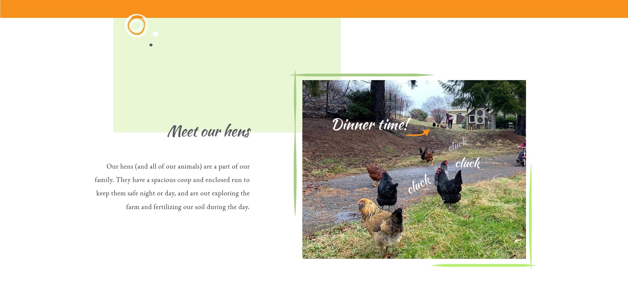
Comeback Hill is a small family farm near Pittsburgh, PA, USA, committed to regenerative agricultural practices. Focus was on creating a logo that reflects the mission of Comeback Hill and fits their target audience (families with children, living near enough to visit the farm for their events). Logo icon - a sapling growing from a tree stump - reflects the regenerative aspect, transition and strength/hope in that change, that Emma chose as her core message. Following on the playful, hand-drawn style of the logo, I created some animal shapes and other doodles that can be incorporated into marketing materials and posts on social media, and Emma liked them so much she sent me photos of all the animals they keep, including bees and a special breed oof sheep, so I could make more animal shapes for her to use. We were lucky that she liked the logo I made without any revisions, so instead of doing revisions, we spent more time considering options for applications of the logo on business cards, leaflets and labels, the sign for the farm, etc. It was such a fun project and a great experience working for Emma!
(Web: www.comebackhill.com)
![]()


![]()


![]()
Any thoughts on what we've done? Something you'd like us to do?
Drop us a message at
hellSPAM PROTECTION, PLEASE REMOVE THIS PARTo@zepp.rs
.