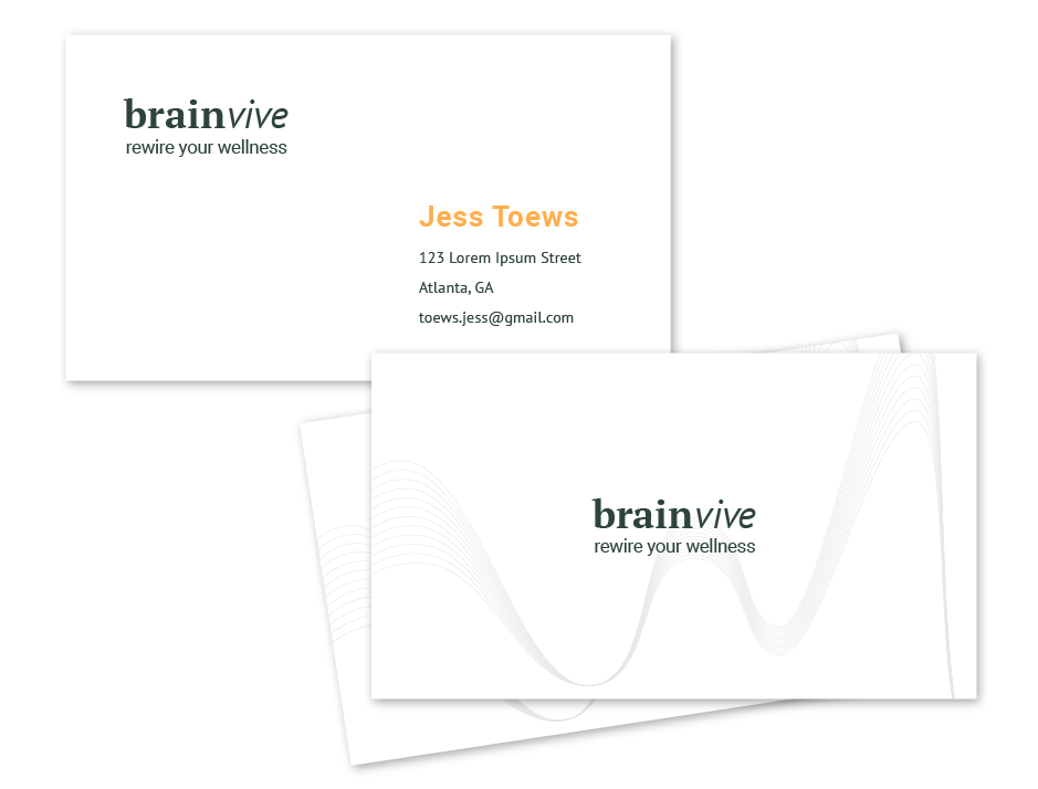
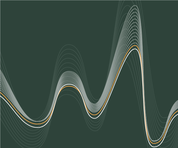
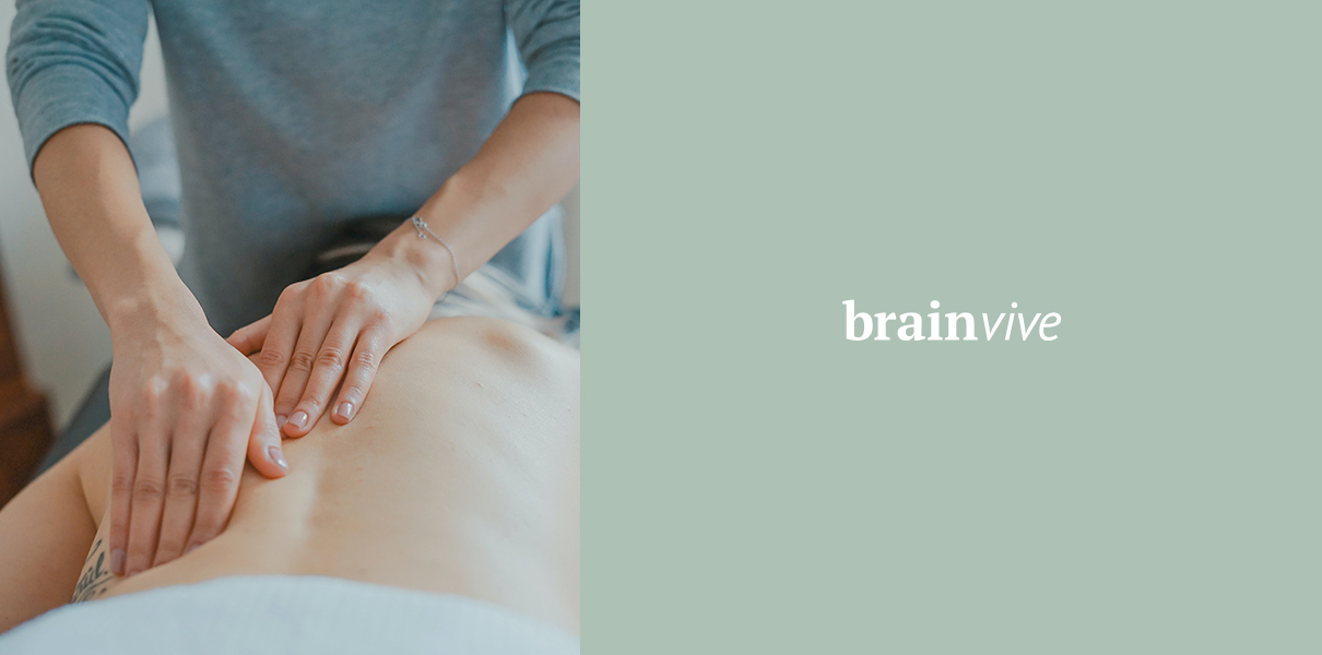
BrainVive is a wellness center for sensory integration and toxin-free living, the first to be doing this type of therapy in Atlanta, GA, USA. They help people who have suffered traumatic brain injuries, strokes or concussions; people with ADHD, or ADD, memory or executive functioning issues, and children struggling with reading, or who were told they're dyslexic. From a marketing standpoint, the primary target audeince are women 32-55, but men as well, including executives and athletes. Keywords and key look/feel for the brand were described as innovative and modern but approachable, timeless and a little high-end, trustworthy while pushing the envelope. Jess, the founder of BrainVive, had specific ideas for the logotype and we focused on finding the option that was the best fit. With colour palette, although she started off with a classic and simple black and white combo, in development she realised it was too stark and formal and we softened the palette using a friendly, optimistic orange, and a range of sage greens and olive tones that reflect BrainVive's approach and methods.
(Web: www.brainvive.com)
![]()

![]()
If you've got any thoughts on what we've done or what you'd like us to do,
drop us a message at
hellSPAM PROTECTION, PLEASE REMOVE THIS PARTo@zepp.rs
.