FAQ
No, seriously; when we say FAQ, we mean FAQ, not some advertising mumbo-jumbo. These are the actual questions we often get from our clients during our design and development projects. We've put it all in one place to make it easier to share the answers.
If you don't see what you are looking for, let us know and help us expand this page with stuff you will find useful.
Above "the fold"
Our first-time clients are often worried about the Home page being too long; they've been told it's good to keep it so short their users won't need to scroll to see everything on the page, that it's bad to have things "below the fold".
The term "above the fold" is an old design concept historically related to the upper half of the front page of a newspaper. As papers are often presented folded so that only the upper area is visible, this is where the editors will place the most important or enticing information to maximise sales. The concept is used in web design today, although the more appropriate term might be "above the scroll". Not surprisingly, the initially viewable area of a website's Home page is usually one of the areas that receive most attention from visitors.
Some are of the opinion that ALL important information MUST be placed where it's visible without scrolling. Although a web designer's job would be so much easier and more boring if simply cramming everything at the top of the Home page would solve all our clients' problems, it's really not that simple.
Firstly - exactly where is that fold, on a web page? On a phone, one can only see maybe the top 300 pixels. Using a laptop, they see maybe twice as much. On a desktop monitor, they see 1024 or more; on a TV, the page is visible top to bottom. Or the user might resize their browser window and see less. So where is that "fold"? It's impossible to say unless you know the exact size of user's browser window.
Then there's the fact that users scroll. Over the years they've gotten used to using web content of all shapes and sizes, and to scrolling using the keyboard, mouse wheels, touchpads and touch screens. It's no longer a question of whether they are aware that there's more to a web page than the area they see without scrolling; the question is - is the content they initially see engaging enough to convince them the rest is worth viewing. The reality is that, depending on the device they are using and their attention span, some users will not see all of your content. No way around it. Even if you guessed where the fold was and managed to cram all your content up there, you'd still end up with such a cluttered and confusing design that users wouldn't notice everything, and worse, they'd be so put off by the mess that they would click out instantly.
Our suggestion is to prioritise. The material that's the most important for the users' goals and/or your business goals should go first (for instance: basic info about your business and products/services, branding clues, main navigation, important call-to-action areas). We advise dividing your Home page content into easily digestible chunks and then deciding on their relative importance. The more important the chunk, the higher it should be placed; priority information goes on top; less urgent to the bottom. That way each bit of information gets some room to breathe and be absorbed, and users are invited deeper down the page and into the rest of the website through quality content and presentation and strategic positioning of visual cues where most common 'fold' points are expected.
We believe all pages - and certainly the Home page - should be attractive and informative. We don't try to force-feed the user everything at once; getting them them to click through to other areas of your website is our priority. After all, the Home page is your website's index - not your entire website. Its goal should be informing the user what the website offers, and linking to other areas where users can achieve their goals.
Bypassing web cache
Almost all web pages you normally view in your browser are made up of different elements, each of which is stored in a separate file on a web server. For instance, main copy (text) of a web page might be stored in a .html file; images could be stored as .jpg or .png files; information about font sizes, layout, colours and similar will be stored in a yet another text file called a style sheet; and some of the code needed for the web page's functionality is saved in a script file. When your browser loads a web page, it actually requests all these files from the web server, and then puts them together to render a web page as you see it. In order to make your browsing faster, when you visit a web page, your web browser may store some of its elements in a cache (a special file folder) so that they do not have to be downloaded again each time you visit. Cached material has an expiration date to ensure you are not ever likely to be viewing outdated content.
Another type of web cache exists on networks that implement a proxy server. Data from websites visited by all the network's users is saved in proxy server cache. When a user navigates to a website in their browser, a request is made to the proxy server to check whether that specific website already appears in the cache. If the material already exists in the cache and is not stale, it's served to the user from the cache instead of being downloaded again, improving accessibility and efficiency on networks where amount of traffic exceeds available bandwidth.
Usually, even if your web browser has a cached version of a web page, it will check with the server for any changes. Sometimes glitches confuse this communication, however, leaving the viewer with a web site that looks weird. This is especially common when changes are made to style sheets - if, say, you are viewing a website we are currently working on - which can cause a page to be rendered in an odd way. Or, a page might appear unchanged, because you are actually viewing the cache, while we have changed it on the server.
There are two ways to solve this problem: a hard refresh, which bypasses the cache and loads the actual page as it is stored on the server; and clearing your cache.
A hard refresh is useful when you want to make sure that they are viewing the most recent version of a web page. Instead or refreshing the web page as you are probably used to doing, by clicking the 'refresh' button or pressing the F5 key, for hard refresh, hold down the Ctrl/Apple command key while clicking the 'refresh' button or pressing the F5 key. This will cause your browser to abandon any cached files and display the web page as it currently appears on the server.
A tab for adjusting the size of your cache and clearing it out should be in the options menu of your browser. Clearing the cache will remove all of the data saved from your previous visits to web pages, which means that the entire page you request afterwards will be freshly downloaded. (By the way, if you are ever having difficulty with your browser - if it's unusually sluggish, for example - clearing the cache may help solve this issue.)
What are cookies?
As you've probably guessed, we mean the web browser kind, not the yummy baked treat. Sorry to disappoint.
A web cookie is a small packet of data that is often, while you are browsing a website, stored in your browser by the website. Every time the browser loads a page from that website, the cookie is sent back to the server to notify the website of some of your previous activity. This is a standard method used for, say, checking if you've logged in into a system, or remembering which items you have placed in a shopping cart.
Although cookies are perfectly legal and safe to use (so long as everyone is playing fair), because they can also be used for tracking users' activity by certain websites, there are some privacy concerns. This is why we always try to warn the users if the website we are creating uses cookies, even if it only is for purposes of logging the user in and remembering who they are so they can be served appropriate information.
What is SSL?
SSL (Secure Sockets Layer) is a protocol for transmitting private data via the Internet. It uses a cryptographic system to encrypt confidential data like passwords or credit card numbers. By convention, URLs that require an SSL connection start with 'https' instead of 'http' - you've probably seen these in the address bar of your browser. Many users know to look for the secure padlock icon or green browser bar indicating a secure connection before proceeding with a private transaction.
If you want your website to handle transactions that require certain encryptions (like e-commerce), you need to get an SSL certificate with your hosting plan. An SSL Certificate is small data file installed on a web server that digitally binds a cryptographic key to an organization's details and identifies your website (so that people can be sure that it really is your domain they are visiting). This means we can use HTTPS authentication on your domain - which is to say, encrypt the traffic that goes between your servers and the customers. That way any sensitive data that hackers intercept will be useless to them and your customers are safe from attacks.
Raster vs. vector files
A raster graphic - or a bitmap - is an image that consists of pixels. These are often photos and complex images. A vector image consists of vectors - shapes made of points that are mathematically calculated when the image is displayed. Vector graphics are often simpler and less life-like than raster graphics, but because they do not rely on pixels - which in any given file are only so many - but rather on shapes that can be recalculated each time an image is zoomed in, they are great for certain purposes. For instance, the image below shows a logo we created for a client; if we create it as a vector, the logo can be resized as needed - small enough to fit on a pen, or large enough to be printed on a large poster or a van. If we'd created it as a raster image, the logo could not have been resized without becoming blurry and pixelated.
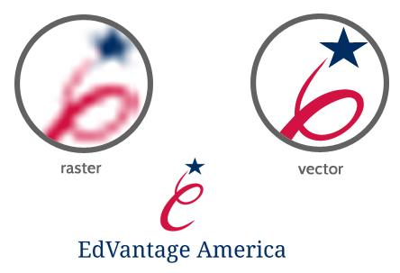
Editting vectors can sometimes be much easier than editting raster images, because instead of manipulating individual pixels or groups of pixels, we can simply change the 'formula' that defines the object in one quick and clean operation. This is why, if someone else has created a logo for you, we may ask you for a vector file (.ai or .eps); it's much more easily adapted for other media than a raster file.
What is "bleed"?
Let's say we're designing you a business card with a solid black background. It's a 3.5" x 2" business card, so we create a 3.5" x 2" black area and send it to print. During the printing process, the paper moves just a bit and you end up with a business card with an unsightly paper-coloured border along the edge. Not good.
So what's usually done to prevent this from happening? We consider the 3.5" x 2" rectangle borders to be the trim lines - lines along which the finished piece will be cut. Then we add a little area - called a "bleed" - usually 1/8" outside the trim lines, and extend our dark background all the way out across the trim lines. Don't worry, we'll keep all your contact info and such inside the trim lines; but the bleed will ensure that even if there is a small misalignment during print, once the business card is trimmed down to actual size, it will still be elegantly black edge to edge.
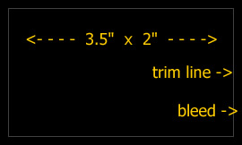
Bleeds are expected by all good printers; most printers ask for specific sizes or offer already set templates for artwork to be printed. If you know which printer you'll be using, ask them for this information (or check the website, it's often listed there), so we know in advance to prepare your print files for best results.
Business card sizes
Although there is no standard for the business card dimensions or ratios, going with a commonly used size is often a good idea (to make storage easier). Here are some of sizes used:
| UK, France, Germany | 85 x 55 mm |
| Australia | 3.370 x 2.125 in (credit card size) |
| Canada, USA | 3.5 x 2 in |
| Finland, BH, Serbia, Montenegro | 90 x 50 mm |
There's more info and a detailed table of dimensions used in different regions on Wikipedia.
Flash animations and "flash" animations
We are sometimes asked if we do Adobe Flash websites or animations. It has been our experience that our clients don't know exactly what Flash is and call all effects and animations on a web page "flash", whether they in fact are or aren't. That's fine, it's not a client's job to know these details. So just to be clear about it - we don't do Flash. Here's why:
- it doesn't work if Flash plug-in isn't installed user-side,
- there is no Adobe Flash Player for iOS devices (iPhone, iPad and iPod Touch), and most cell phones,
- it can hurt website's accessibility and often isn't search engine friendly,
- it can increase your website's size so that it's impossible to load on low bandwidth connections (like public wireless),
- Adobe is ditching it in favour of HTML5.
However, this is not to say we can't create some Flash-like effects and animations, using better platforms like HTML5 and jQuery. While Flash is installed as a third-party plug-in in web browsers, jQuery is a library - a simple text file - we include in a web page (so no plug-in installation is needed). This ensures that the animated effects will work on almost all platforms (yes, on iOS devices too) and, where they don't, the content will still be perfectly accessible to the users.
To be fair, there are still some uses for which Flash is better than jQuery, and we'll be sure to warn you if this is the case so you can find the best solution. For most purposes though - such as navigation drop-downs, expandable content areas, widgets (say, a data picker), or colour animations - HTML5/CSS3/jQuery offer a cross-browser consistent, accessible, and search engine friendly solution.
Static vs. dynamic pages
A static web page is one that is designed and saved on the server before there are any requests for the information it contains; it displays the same information for all users at all times. It is delivered to the user exactly as stored, in contrast to a dynamic web page which is generated by a web application which creates pages on demand.
For instance, let's say our client, a local youth theatre, want designed a page that displays their repertoire for this month. We create a static page, it should always show the same information regardless of who's viewing it, when they're viewing it, or what precise information they need.
But now our client, say, want to allow their website visitors to search their repertoire by criteria such as date, genre, or leading actors. A dynamic page is called for; we create a database containing all the data about the entire repertoire, individual plays, playwrights, actors, stage directors, etc., and a template into which relevant information is inserted upon visitor's request, displaying only the information they wanted - for example, only plays created by their favourite playwright that they can see next week.
We also create dynamic pages for content our clients wish to be able to upload themselves through an administrative back-end (or a CMS, as it's also called). An instance would be a blog section of their website, or, to continue our previous example, if our youth theatre wish to have the ability to upload a fresh repertoire each month, we would create a password-protected back-end where they would upload the information to their database, and from there it would be inserted into a dynamic page to be displayed to their visitor.
(More info on CMS can be found here.)
So, what are some advantages of using static pages?
- They are almost always cacheable, and therefore displayed more quickly to your visitors,
- they are often less costly, as less skill is required to create them, and they don't require any particular type of hosting service.
There are also disadvantages to using static pages only:
- they are usually not very interactive,
- since static pages must be re-published each time content is changed, maintaining large numbers of static pages can be impractical without automated tools,
- they cannot display differently to different viewers, depending on login status or other factors.
We create dynamic pages when fresh information (content and/or layout) is needed for each individual viewing. The advantages of dynamic pages are:
- they offer highly personalized and customised visitor options,
- they don't need to be re-published just because some of the content has changed, as fresh information will be inserted upon visitor's request,
- in the long run, they may be more time- and cost-effective than static pages, as, if our client has had a back-end built for their website, they can update content of their pages on their own, without having to reach out to a web designer each time they need new information published.
On the other hand, there are a couple of downsides to dynamic pages:
- because search engines may not be able to access some database structures, especially those that are secure, more skill is required to make the URLs simple, clean and accessible for search engines,
- dynamic pages are more resource-intensive compared to static pages,
- dynamic pages execute code on your server, and can read from and write to your database; they require more care so that there aren't any security problems.
Whether static or dynamic pages are used depends on what kind of information and interaction our client wishes to present to their visitors. Not sure which is the best way to go? Let us know what you want your web pages to do and we'll take it from there.
Domains, DNS servers and hosting
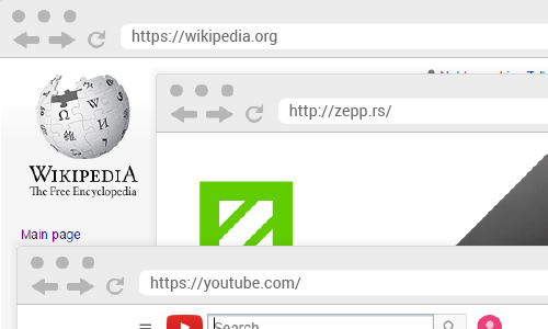
A domain name identifies your website. It's a label that defines a part of the Internet that you have full control over. For instance, wikipedia.org is Wikipedia's domain name, youtube.com is Youtube's domain name, and our own domain name is zepp.rs.
One registers a domain name via a registrar (or a hosting provider that can also handle the registration for you). Check out various providers; they offer a wide variety of prices and plans (for instance: Namecheap, Hover, Squarespace, GoDaddy).
Things to keep in mind:
- Always insist on using your name for Administrative contact (as opposed to your ISP's contact or employee's name, for example) to indicate you're the actual owner and avoid future issues or disputes;
- Be sure to get spelling and punctuation correctly (because these errors can't be corrected after registration, save for registering another domain name);
- Note that your domain name expires after a while (say, a year) and becomes available for registration by others. If you wish to keep it, make sure you re-register it on time.
If you want to have a website online - which is to say, a bunch of web pages that show up in a browser when your domain is entered in the address bar of the browser - you'll also need a web hosting provider, a home for those web pages. Web hosts are companies which have servers that are always online; for a monthly fee, you can have a space on their server where you can leave the files that make up your website. Whenever a user enters your website's domain name in their web browser, the browser is sent files from the host's server so it can display your web pages.
When purchasing hosting, be sure to check if they offer what you need (operating system, database and scripting software). A very common configuration is Linux, Apache, MySQL, and PHP/Perl/Python - and this is the type of service you'll need for the kind of websites we do.
Some of the most popular hosting providers are Amazon Web Services, Dreamhost, GoDaddy, Namecheap, Network Solutions, Squarespace, and Stablehost.
When registering a domain (or at any point later on when you decide to set up your hosting and website) you'll need to enter domain server addresses. The DNS servers are the servers that 'know' that your domain name corresponds to your web hosting location. Usually, your web hosting provider handles this service, so their servers should be placed in your domain registration record. The domain name and a hosting service are often purchased separately (from different providers) and then set to work together through DNS Servers.
Search engine optimisation (SEO)
When searching for information online, most people turn to search engines like Google, Yahoo or Bing. Even if driving traffic to your pages isn't your primary concern, enabling search engine bots to find and index your website properly is important. To attract traffic, your website needs to pop up high up on the first page for certain search phrases. This is what SEO is all about - tweaking stuff on-page and off-page to get top ranking in the search results.
We do basic on-page SEO. We don't do off-page and in-depth on-page SEO. More information on what we do or don't do, and how to select a good SEO provider you can find here.
If you simply want to create a website, have us do some basic optimisation and then give it a couple of months to see how it performs before deciding if you need to invest in a more advanced SEO work, we'll need you to work with us while creating your website. What we'll need from you is help creating a good navigation structure, quality content and maybe a blog.
Design and development tools we use
Technologies and software we employ in our daily work include:
Adobe Photoshop
Photoshop is a graphics editing program developed by Adobe Systems. It is widely used by photographers, graphic and web designers. Graphics created in Photoshop are mostly raster graphics. The default file extension is .psd. We mostly use Photoshop for creating mockups of web pages, so that you can see what your website would look like before we start coding it.
Adobe Illustrator
Illustrator, another Adobe product, is a vector graphics editor for making graphic design and illustrations. Pictures created in Adobe Illustrator can be made bigger or smaller, and look exactly the same at any size; this makes it suitable for creating artwork intended for print like logos, business cards, flyers. The default file extension is .ai.
HTML
HyperText Markup Language is the predominant markup language for web pages. HTML elements form the building blocks of all websites - text, links, tables, lists, photos, web forms and multimedia content. The default file extension for a document marked up with HTML is - unsurprisingly - .html.
CSS
Cascading Style Sheets (CSS) are files which contain information about how web content should be displayed. Font faces, sizes of text or images, colours, backgrounds - all these are defined in one or more .css files.
JavaScript and jQuery
JavaScript is a script language that defines some of the behaviour of a web page. It is executed client-side (which is to say it runs in your web browser) in order to provide enhanced user interfaces and dynamic websites.
jQuery is a fast and concise JavaScript Library that simplifies HTML document traversing, event handling, animating, and Ajax interactions for rapid web development.
AJAX
AJAX stands for Asynchronous JavaScript and XML. It is is a group of interrelated web development methods used on the client-side to create interactive web applications. With Ajax, web applications can retrieve data from the server in the background without reloading the existing or loading a new page. That way less information needs to be exchanged with the web server and interactions on your website seem quicker and smooth.
PHP
PHP is a widely-used, general-purpose scripting language that is especially suited for web development and can be embedded into HTML. It runs on a web server and handles some of the behaviour of the web page.
SQL and MySQL
Most dynamic websites make at least some use of databases, and many do so extensively. SQL is a language used to interact with relational databases and therefore vital to any serious web programming project. MySQL is a database management system that uses SQL and runs as a server providing multi-user access to a number of databases.
Wordpress
WordPress is a free and open source blogging tool and a content management system (CMS) based on PHP and MySQL. It is one of the most popular publishing platforms today. Its popular features include ability to switch between different themes (which allow for a relatively easy change of the look and functionality of the website) and plugin architecture (which allows for quick and usually painless extensions to existing functions and features of the website). If you need us to build you a website which has a blog or an admin section allowing you to edit or add your own web pages, Wordpress is what we'll be using.
Basic safety and password tips
Are you using passwords like "password", "123456" or your name followed by a 1? Are you using them for accounts which are important to you, like main email account, website's domain or hosting control panel? If you are, then one more quick question: are you ok with an utter stranger - or maybe a business competitor - breaking into your accounts and gaining full control over your online presence? If not, here's a few quick tips on passwords and online security.
Responsive web design
(This is a short overview. You can also find a more detailed explanation on responsive web design here.)
A responsive web site is a website which responds and adapts to its environment. The most obvious example is the width of a web page - while most web pages used to be designed for a single window width (say, 960 pixels), they are now often designed to fit the browser window width, whatever it may be: from just under 320px on an older phone, to over 1920px on large desktop monitors. This does NOT mean that a non-responsive page can't be viewed on a device that's not wide enough; it just means there'll be (more) scrolling for the user.
Responsive might require more resources (time and cost) to create. If you have a comfortable budget and a relaxed timeline in view, and a target audience heavily on the go, you'll want responsive. If you're looking to minimise your investment, you can have a non-responsive website to start with and work on responsiveness down the line. If you'd like a responsive website that doesn't hurt your budget too much, read our tips on how to make its creation effective.
Content before design
As a rule, we do not begin any work - design, coding, or even jotting down ideas and sketching - until we have received complete specifications and content required to create a website or print artwork. Design is not just about making things look good, it's also about making content work to achieve desired results. Design without content is pretty much meaningless. Here's why.
File formats
A file format specifies how data is encoded and stored in a file. You'll often be able to tell the file format by its extension - for instance, .jpg is an image encoded in a certain way, .exe is an application, and .mp4 is a video. Here are some file formats we use in our work and may send you as results:
- .jpg pr .jpeg Images compressed by a special algorithm that significantly reduces the file size, making this a popular format for web graphics. This compression is lossy - the more the image is compressed, the smaller the file size, but also the lower the quality of the image. The degree of compression can be adjusted, allowing a selectable tradeoff between storage size and image quality.
- .png Another graphics file format - this one supporting lossless data compression. It also has an alpha channel, so parts of a png image can be transparent, which comes in very handy for web design. We may also send you a png image of your logo on transparent background, which you may then use for embedding in various documents onto different bakcgrounds.
- .gif Much like png, only not so great - although it does support simple animations.
- .psd A document created by Photoshop, which supports lots of useful features like layers and layer masks, transparency, text, clipping paths, and many more. It's a raster format - graphics saved in it can NOT be made larger without reducing quality. We sometimes use this format for web page mockups or simple print artwork.
- .ai Files created in Illustrator, support vector-based graphics - which means they can be editted and resized any way needed without reducing quality. We'll save the original artwork for your logo in this format, for instance, so that your logo can be exported as a very small thumbnail image, or as a huge image intended for print on, say, a truck - and both will look perfect and hi-res.
- .eps Another vector-based format.
- .htm or .html This is usually a web page. HTML is essentially a text file which then includes resources like images and video.
- .js, .php, .css Files which also make up your website, containing information about its functionality and layout.
Logo design deliverables
At the end of a logo design project, we'll create for you a logo pack containing all lockups and file formats we anticipate you may need (horizontal and vertical, colour and greyscale, optimised for web and print use, etc.). Usually, you will receive:
- Vector files (.AI and .PDF)
These are the master (source) files, allowing easy high-resolution resizing or edits; if you ever need another designer working on marketing assets for the brand, we recommend handing them the vectors. The AI file only opens with graphic software (like Adobe Illustrator) so if you can't open it, no worries - your designer will be able to. If you try opening the PDF and zoom in really close, you'll see that unlike with the raster files, the image doesn't become pixelated and blurry; this is the major advantage with vector formats. - Raster files (.JPG, .PNG)
These are for your quick everyday use. (We do not recommend re-saving images from these, as the resulting files would be low quality; or if you do, start from larger PNG files and size down as needed.)
Other formats are available upon request, at the end of the design job. Just let us know what you need.
If you need your logo in any other format or size after the job is finished, please feel free to let us know. It is included in the price of the original logo design, provided you provide us with a clear specification of how you intend to use the logo file (for instance: embed in a document, uplod to a website, print on a mug), what size and quality you need it to be, and whether it needs to be compressed. Also, please let us know if there are any additional requirements (padding within the image, position of the logo, transparency, etc.) before we export the image for you. If we receive your requirements after the image has already been exported, and we need to do redo it, we may need to charge for it additionally.
Please note these logo file exports are free of charge only for the original logo. If you need a banner designed, logo included in a brochure, placed on a business card and the card prepared for print and similar - these will be considered a separate design job and charged for. We will of course ask for your confirmation before beginning any work. So while exporting the logo is included in the price of designing the logo, design of other brand assets like business cards or website will obviously be charged for separately. Similarly, a logo refresh/redesign is a separate job that we may need to charge for separately.
Please note that we only keep our design files for a limited amount of time. Usually it's for years, but if it's important for you to have the source files for your logo, please be sure to archive the file pack we give you at the end of the design project. We or other designers may need these to edit or use your logo at some point.
RGB and CMYK colour spaces
RGB is a colour space based on light - red, green, and blue light are added together to reproduce a wide range of colours. Electronic displays (computer monitors, TVs) and some desktop printers use RGB; and we use it when creating websites and artwork intended for electronic displays.
CMYK is a colour space based on ink. Graphics in CMYK mode are used for professional printing. CMYK stands for the 4 colour process inks used for offset press printing - cyan, magenta, yellow and black. By combining these inks almost any colour can be made; this is why CMYK is used for full colour printing.
RGB is a device-dependent color model; different devices reproduce a given RGB value differently, depending on the quality and manufacturer of the device, its settings and condition. An RGB value doesn't define the same colour across devices without some kind of color management. Also, the RGB colour space does not correspond exactly to the CMYK colour space. This is why a colour which you see on a computer monitor may not be the colour that will come out of print, or why a RGB colour we use based on a print colour you provide may not match what you expect. Possible solutions to this problem include, for preparing your print materials, using Pantone Matching System, which allows designers to match specific colors regardless of the equipment used to produce the color; and 'proofing', a cost-effective way of the printer providing you with a copy of what the final product will look like (whether by producing a printed sample or reproducing the artwork on a highly accurate computer display). For screen use, we may need to adjust the RGB values until they match the colour you had in mind, that matches your chosen Pantone or CMYK value.
Web-to-print
Web-to-print sites offer online purchasing of business cards, stationery, brochures, flyers, etc. They will allow you to upload the artwork we create and then print it and mail it to you.
Moo.com - high quality paper and good color accuracy
Vistaprint.com - lower prices and a bit lower quality, though many of our clients tell us they're happy with it
48hourprint.com
PrintingForLess.com